Plot Evolution
This notebook shows an example on how to import the bolometric properties of the SLSN population and plot their evolution. First, import the required packages.
from slsne.utils import cb_g
from slsne.lcurve import get_evolution
import numpy as np
import matplotlib.pyplot as plt
plt.rcParams.update({'font.size': 11})
plt.rcParams.update({'font.family': 'serif'})
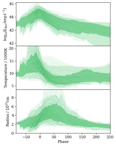
Use the get_evolution function to get the bolometric luminosity, radius, and temperature evolution of all SLSNe in extrabol.
# Samples are the time samples at which the light curve is sampled
samples, interp_lum_array, interp_temp_array, interp_radius_array = get_evolution()
Now we can calculate the 1, 2, and 3 sigma ranges for each of these parameters:
lum_low3, lum_low2, lum_low1, lum_mean, lum_hi1, lum_hi2, lum_hi3 =\
    np.nanpercentile(interp_lum_array, [0.13, 2.28, 15.87, 50, 84.13, 97.72, 99.87], axis = 0)
temp_low3, temp_low2, temp_low1, temp_mean, temp_hi1, temp_hi2, temp_hi3 =\
    np.nanpercentile(interp_temp_array, [0.13, 2.28, 15.87, 50, 84.13, 97.72, 99.87], axis = 0)
radius_low3, radius_low2, radius_low1, radius_mean, radius_hi1, radius_hi2, radius_hi3 =\
    np.nanpercentile(interp_radius_array, [0.13, 2.28, 15.87, 50, 84.13, 97.72, 99.87], axis = 0)
Finally plot the results
xmin, xmax = np.min(samples), np.max(samples)

plt.figure(figsize=(5,7))
plt.subplots_adjust(hspace=0)

plt.subplot(311)
plt.ylim(41.8, 45.1)
plt.xlim(xmin, xmax)
plt.plot(samples, interp_lum_array.T, color = cb_g, alpha = 0.1, linewidth = 1)
plt.fill_between(samples, lum_low1, lum_hi1, alpha = 0.6, color = cb_g, linewidth = 0)
plt.fill_between(samples, lum_low2, lum_hi2, alpha = 0.2, color = cb_g, linewidth = 0)
plt.fill_between(samples, lum_low3, lum_hi3, alpha = 0.1, color = cb_g, linewidth = 0)
plt.ylabel(r'log$_{10} (\mathit{L}_{\rm Bol}\,/$erg$\,s^{-1})$')
plt.tick_params(axis='both', bottom=False, labelbottom=False)

plt.subplot(312)
plt.ylim(3.5, 21)
plt.xlim(xmin, xmax)
plt.plot(samples, interp_temp_array.T, color = cb_g, alpha = 0.1, linewidth = 1)
plt.fill_between(samples, temp_low1, temp_hi1, alpha = 0.6, color = cb_g, linewidth = 0)
plt.fill_between(samples, temp_low2, temp_hi2, alpha = 0.2, color = cb_g, linewidth = 0)
plt.fill_between(samples, temp_low3, temp_hi3, alpha = 0.1, color = cb_g, linewidth = 0)
plt.ylabel('Temperature / 1000K')
plt.tick_params(axis='both', bottom=False, labelbottom=False)

plt.subplot(313)
plt.ylim(0, 9.8)
plt.xlim(xmin, xmax)
plt.plot(samples, interp_radius_array.T, color = cb_g, alpha = 0.1, linewidth = 1)
plt.fill_between(samples, radius_low1, radius_hi1, alpha = 0.6, color = cb_g, linewidth = 0)
plt.fill_between(samples, radius_low2, radius_hi2, alpha = 0.2, color = cb_g, linewidth = 0)
plt.fill_between(samples, radius_low3, radius_hi3, alpha = 0.1, color = cb_g, linewidth = 0)
plt.ylabel(r'Radius / $10^{15}$cm')
plt.tick_params(axis='both')
plt.xlabel('Phase')
plt.show();